
Fruit of the Loom
Rebranding including logo, branding, packaging, tone, photography and in-store experience.
With the launch of the new campaign, Start Happy, it was time for Fruit of the Loom to make their packaging more "happy" as well. But how do we make every Fruit of the Loom package the little beacon of happiness that makes shopping for underwear fun again?
—
Client: Fruit of the Loom
Role: Designer


Our goals were to:
1. Create a color system for each size & option showing product from the front.
2. Improve visual hierarchy and improved visibility of the most important info.
3. Communicate key product features.
4. Update branding and dimensions of the package.
5. Solve for the lack of differentiation between brands.
Guiding Principles:
1. Use our proprietary colors to make us stand out and differentiate us from the category.
2. Eliminate visual clutter.
3. Photography should trigger emotion and express our brand territory: Start Happy; but most importantly photos should convey product silhouette and fit.
4. Clear indication of product’s characteristics (color/pattern,silhouette, size, fabric & quantity).
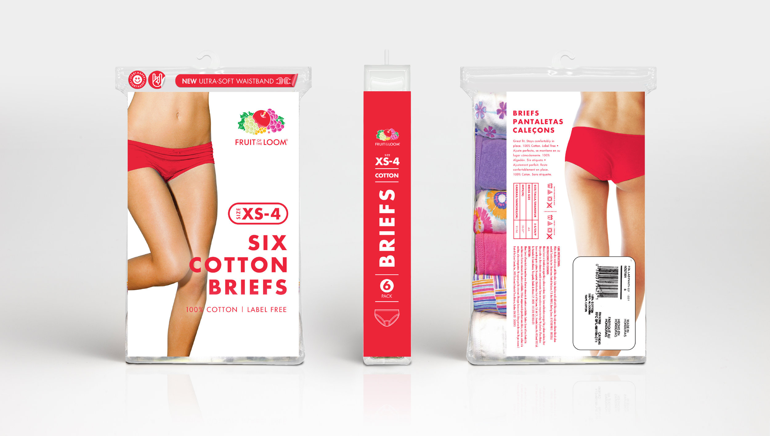


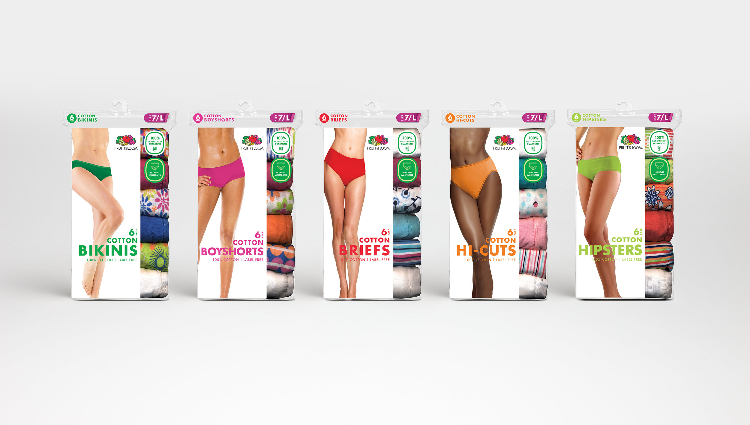
In order to do this, our color palette was brought to the forefront making Fruit of the Loom pop off the shelves compared to their competitors. To keep shoppers from tearing the bags open to feel the fit and material, a sample of each style would hang next to their corresponding package. A "Periodic table of Underwear" chart would accompany the packaging helping shoppers quickly find their fit and stop them from fumbling through all the packaging.
Not up for buying a combo pack? Thats okay. An "off the vine" was created for those who just want to buy a single pair or mix and match their favorite patterns and styles.
The photography on the packaging was also updated from a model to a real person with curves and beautiful imperfections. We wanted our "models" to feel real so our shoppers can see exactly how the underwear will move and fit. The crop of the model was also revised from showing her face and torso to just her hips, thighs and legs.
To help visualize the idea and bring this packaging concept to life, we created an "at shelf experience" in the design department. We built a peg wall and shelves, a replicate of what it would be like to shop this new experience.

Brand Photography
A Modern Americana
Our photos will be slices of everyday life. They’ll be shot “documentar y style;” as if we’re secret spectators viewing private life. We will celebrate people’s uniqueness and richness on their own terms. We aren’t af ter the American Apparel, Diesel and David Beckham at titude and aesthetic. It ’s not who we are.
100% Natural & Unstaged
Our models won’t be in situations that feel forced or unrealistic. Our shots won’t look staged. Our models’ emotions will feel real, authentic and not over-acted or directed by someone behind the camera. Their body language will exude happiness, confidence and have tons of movement.
Real People
Our casting should be rich in diversity, ethnicit y and shapes. Our models should look fit, healthy, and athletic. We’ll cast families, teenagers, millennials, and parents having fun in their underwear, naturally.
Photography shot by Augustus Butera


Fruit of the Loom Website


